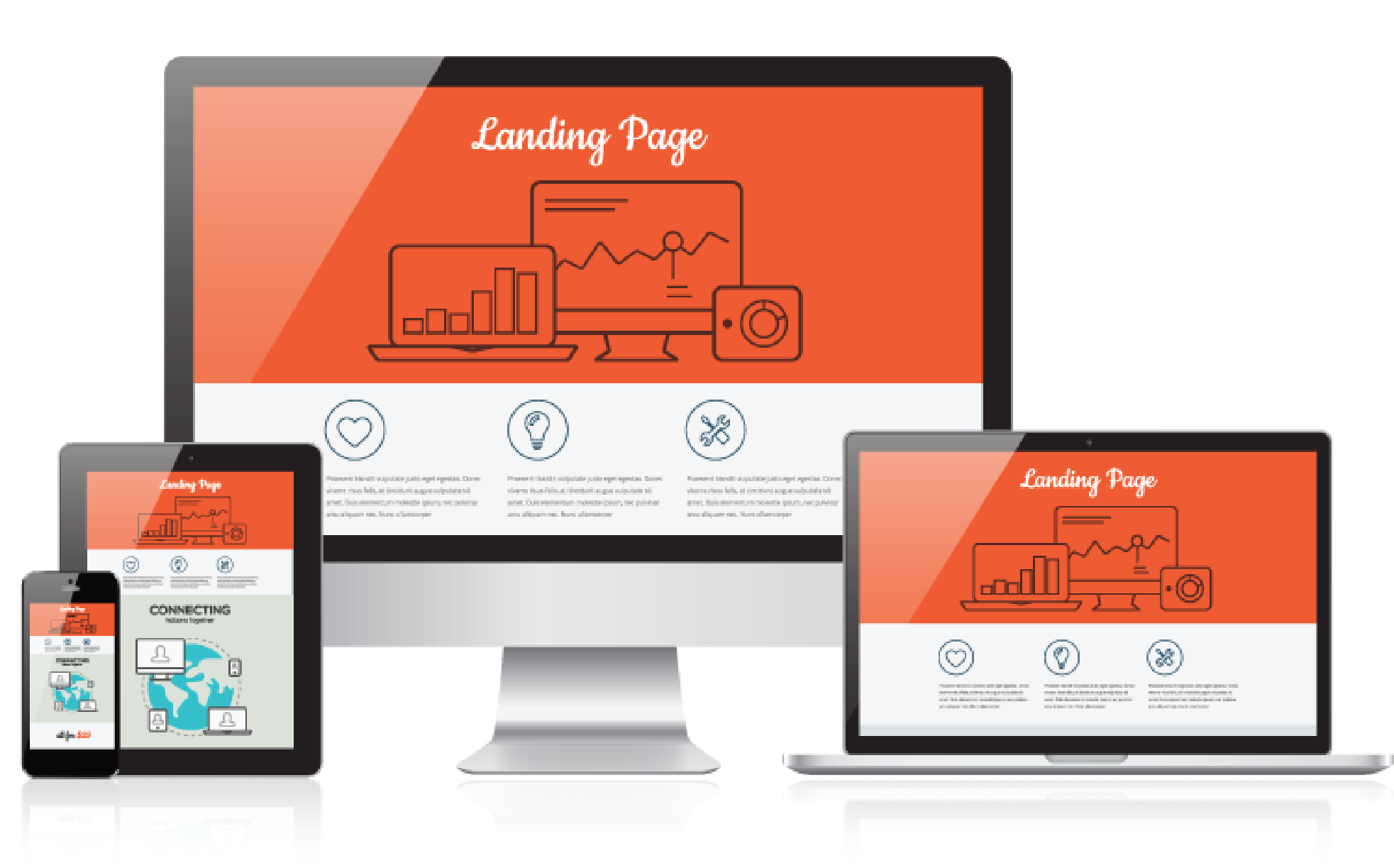
Building High-Converting Landing Pages
2024-04-03
Building High-Converting Landing Pages
Creating a landing page that converts isn’t just about pretty visuals. It’s a mix of psychology, design principles, and performance optimization. Let’s break down what really works.
✅ Strong CTAs
✅ Fast loading
✅ Mobile-first
✅ Clear value proposition
🚀 What Makes a Landing Page Convert?
- Single Goal Focus: Eliminate distractions. Your page should have one purpose.
- Hero Section with Value Prop: Visitors should immediately understand what you offer and why it matters.
- Prominent Call-to-Action (CTA): Whether it's "Book a Call" or "Start Free Trial," place it above the fold and repeat it where it makes sense.
- Visual Hierarchy: Use size, color, and spacing to guide the user’s eyes toward important actions.
- Speed & Responsiveness: Users bounce if it takes more than 3 seconds to load. Optimize Core Web Vitals.
- Social Proof: Add testimonials, client logos, or usage stats to build trust.
📈 Quick Conversion Tips
- Test different CTA texts ("Get Started" vs. "See Demo")
- A/B test layouts and images regularly
- Use urgency or scarcity ("Only 3 spots left")
- Highlight benefits over features
📍 Tools I Use
- React + Tailwind for fast, responsive layouts
- Netlify for fast deployment and CI/CD
- Hotjar or Microsoft Clarity for visitor tracking
📄 Great Landing Page Inspiration
Here are some of the best places to find top-tier examples:
Use these for layout, copy, and structure ideas.
💬 CTA
Need a high-converting landing page for your product, course, or campaign?
Let’s talk. I design with performance and clarity in mind.
Get in Touch or email me directly
Thanks for reading 🙌
#Landing#Conversion#UX